


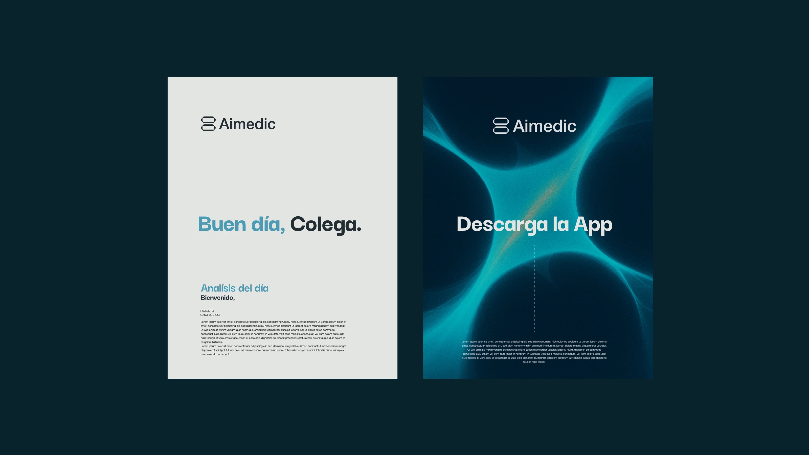
Aimedic
- Year
- 2025
- Category
- Branding
- Services
- Brand design
Brand identity for AIMEDIC, a health-tech brand built on the idea that organisms survive because they're organized — every part plays a role that sustains the whole system. The sentinel bee was the starting point, standing for collective precision as a form of care. The reference went further, into the beehive's architecture, where every cell has an exact place within a larger system, and into the formation of DNA, the code that carries science and life. That logic became identity: the hive turned into a method of organization, the DNA into the shape of the logotype, and real X-rays into a texture that weaves together science, body, and technology. AIMEDIC takes something that exists in nature and in medicine and carries it further — a brand that doesn't just diagnose, but anticipates. Precise data, vital decisions.