


BIOHUNTERS
- Year
- 2026
- Category
- Rebranding
- Services
- Brand design
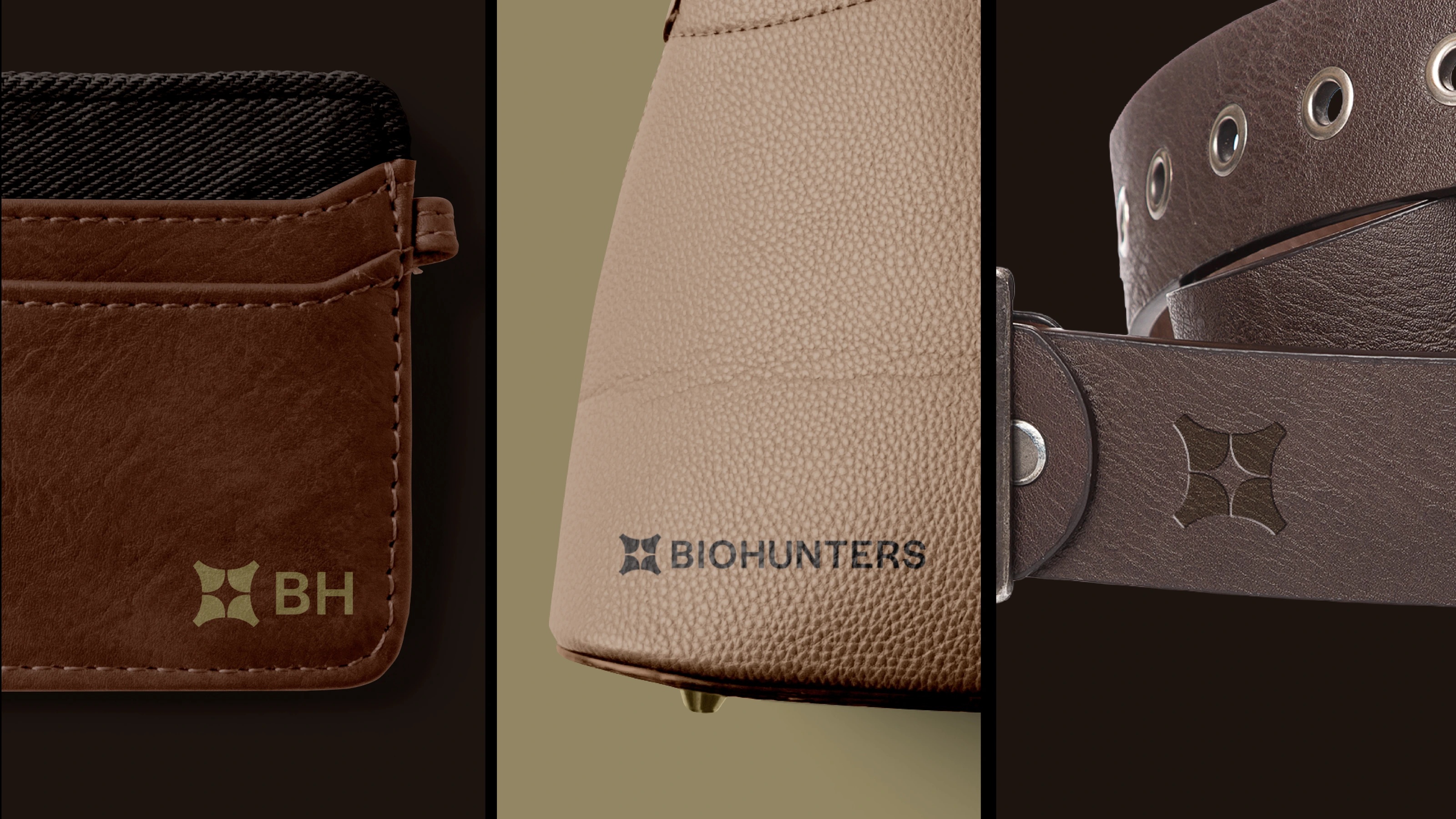
Brand identity for BIOHUNTERS — they don't hunt resources, they hunt solutions. BIOHUNTERS was born from a simple conviction: the future isn't waited for, it's hunted down. From coffee husk and pulp — what the industry discards — the brand develops a new plant-based leather that redefines premium leather goods through the circular economy. Its visual language starts from two ideas: millimetric transmutation, where geometry imposes industrial order on organic chaos, and the hunter spirit, the clinical eye that finds value where others see only waste. Their meeting gave rise to the BIOHUNTERS isotype, a figure that evokes the brackets and crosshairs of someone tracking and framing their target. From there, the identity takes a direction that's both technical and organic — typefaces that blend a serif's editorial warmth with a sans inspired by industrial signage precision, an earth-and-amber palette, and a texture born from coffee sack weave that brings artisanal memory to every application. Because at BIOHUNTERS, sustainability isn't an accessory — it's the very structure new materials are hunted upon.